Carefully handcraftedby real goblins
Hinted & optimizedfor screens
Supports Latin BasicCore A-Z coverage
OpenType featureskerning, ligatures & more
Styles (18)
TTF / WOFF2Showing 9 of 18 styles
See Burrow Ledger in use
Poster Design
Bold statements that stand out.
Cold Brew
Packaging
Clean, modern, and shelf-ready.
Logo & Branding
Strong identities, built to last.
Web & UI
Readable, responsive, reliable.
Collection
Social Graphics
Engage across every platform.
Try Burrow Ledger
Fork
About Burrow Ledger
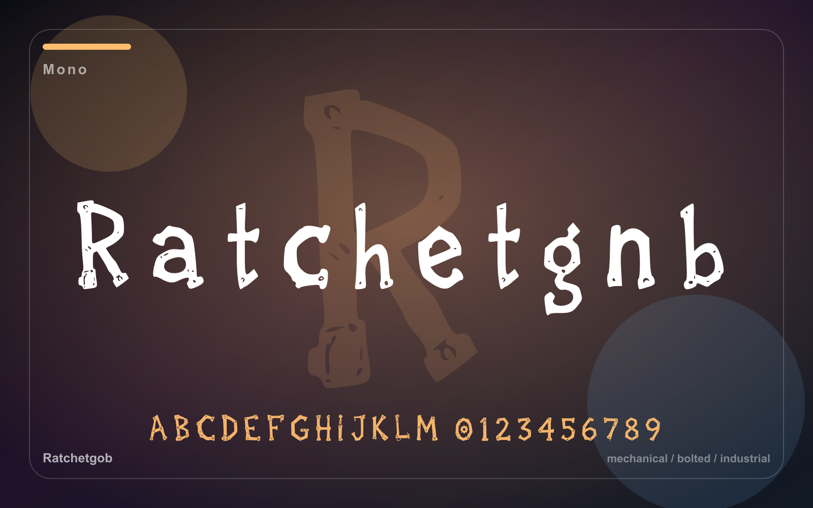
Goblin utility mono for crates, ledgers, and inventory labels
Review highlights
What designers say
4.8
Based on 12 reviews
- 5
- 10
- 4
- 2
- 3
- 0
- 2
- 0
- 1
- 0
1 / 6
Related font previews
#1 / Mono
Moss Ledger
A utility monospace with earthy field-note character for labels, ledgers, maps, and practical archive systems.
- Best for
- Labels, utility systems, field notes, maps, and archive layouts
- Pair with
- Pair with a warm serif or rounded sans to soften technical layouts.
- Check
- Check dense paragraphs carefully, especially when space is tight.
#2 / Mono
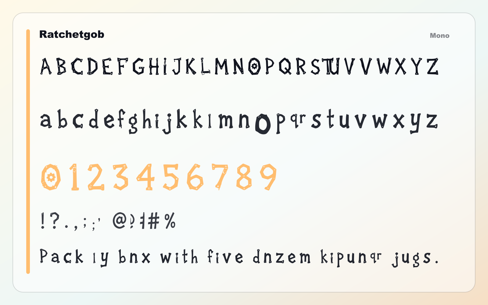
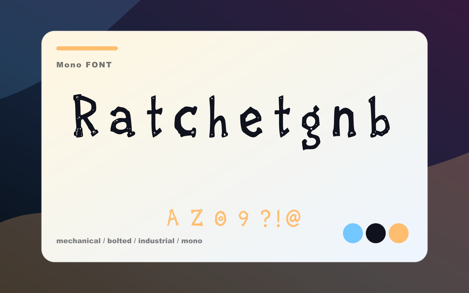
Ratchetgob
A bolted mechanical display face for robot labels, game UI, maker badges, and industrial posters.
- Best for
- Labels, utility systems, field notes, maps, and archive layouts
- Pair with
- Pair with a warm serif or rounded sans to soften technical layouts.
- Check
- Check dense paragraphs carefully, especially when space is tight.
Also appears in
#3 / Display
Bogbell Arcade
A boggy arcade display font with bouncy counters for game titles, stickers, stream overlays, and posters.
- Best for
- Game logos, badges, stickers, and playful UI headings
- Pair with
- Pair with a neutral sans and keep the display face focused on short text.
- Check
- Use it for headlines and marks; switch to a quieter text face for paragraphs.
Also appears in
#4 / Display
Mossbite Display
A mossy goblin display face with toothy cuts for market signs, game logos, and odd little headlines.
- Best for
- Game logos, badges, stickers, and playful UI headings
- Pair with
- Pair with a neutral sans and keep the display face focused on short text.
- Check
- Use it for headlines and marks; switch to a quieter text face for paragraphs.
Also appears in