Updated 2026-05-12 / free commercial fonts
10 Free Commercial Fonts for Client and Brand Work
10 free commercial font families with live previews, project notes, and direct download paths.
Font previews
Open only the ones that fit.
- #1DisplayTop pick
- #2MonoUtility pick4.5
Ratchetgob
Labels, utility systems, field notes, maps, and archive layouts
- #3SerifEditorial pick4.5
Gribblewood
Editorial branding, covers, boutique titles, and culture-led campaigns
- #4DisplayTop pick
- #5SerifEditorial pick4.5
Goblinking
Editorial branding, covers, boutique titles, and culture-led campaigns
- #6DisplayTop pick
- #7DisplayTop pick4.5
Skragg Bonefinger
Short headlines, logos, posters, thumbnails, and brand moments
- #8SerifEditorial pick4.5
Thornhollow
Editorial branding, covers, boutique titles, and culture-led campaigns
- #9SerifEditorial pick
- #10DisplayTop pick
Quick picks by use case
Compare the top 8 free commercial fonts before opening the full previews.
| Rank | Font | Best for | Style | Download |
|---|---|---|---|---|
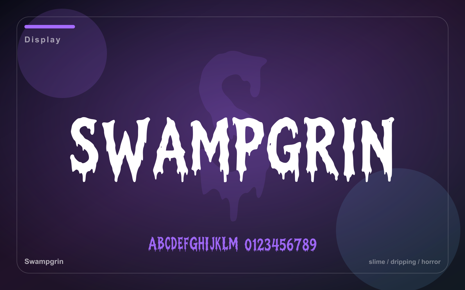
| #1 | Swampgrin Top pick | Short headlines, logos, posters, thumbnails, and brand moments | Display | Free |
| #2 | Ratchetgob Utility pick | Labels, utility systems, field notes, maps, and archive layouts | Mono | Free |
| #3 | Gribblewood Editorial pick | Editorial branding, covers, boutique titles, and culture-led campaigns | Serif | Free |
| #4 | Stonefang Top pick | Short headlines, logos, posters, thumbnails, and brand moments | Display | Free |
| #5 | Goblinking Editorial pick | Editorial branding, covers, boutique titles, and culture-led campaigns | Serif | Free |
| #6 | Sneekgob Top pick | Short headlines, logos, posters, thumbnails, and brand moments | Display | Free |
| #7 | Skragg Bonefinger Top pick | Short headlines, logos, posters, thumbnails, and brand moments | Display | Free |
| #8 | Thornhollow Editorial pick | Editorial branding, covers, boutique titles, and culture-led campaigns | Serif | Free |
Font notes
These picks are public families marked for free commercial use in the font library.
A dripping horror display face for monster titles, Halloween packaging, posters, and thumbnails.
- Best for
- Short headlines, logos, posters, thumbnails, and brand moments
- Pair with
- Pair with a neutral sans and keep the display face focused on short text.
- Check
- Use it for headlines and marks; switch to a quieter text face for paragraphs.
A bolted mechanical display face for robot labels, game UI, maker badges, and industrial posters.
- Best for
- Labels, utility systems, field notes, maps, and archive layouts
- Pair with
- Pair with a warm serif or rounded sans to soften technical layouts.
- Check
- Check dense paragraphs carefully, especially when space is tight.
A heavy woodcut serif for rustic fantasy branding, tavern signs, labels, and chunky headlines.
- Best for
- Editorial branding, covers, boutique titles, and culture-led campaigns
- Pair with
- Pair with a quiet sans for navigation, captions, and body copy.
- Check
- Preview thin details on small screens and busy backgrounds.
A jagged gothic display face for fantasy logos, posters, game titles, and sharp-edged merch.
- Best for
- Short headlines, logos, posters, thumbnails, and brand moments
- Pair with
- Pair with a neutral sans and keep the display face focused on short text.
- Check
- Use it for headlines and marks; switch to a quieter text face for paragraphs.
A regal spurred serif for fantasy crests, chapter titles, tabletop cards, and dark logos.
- Best for
- Editorial branding, covers, boutique titles, and culture-led campaigns
- Pair with
- Pair with a quiet sans for navigation, captions, and body copy.
- Check
- Preview thin details on small screens and busy backgrounds.
A bold curled display face for fantasy badges, spooky packaging, posters, and playful title work.
- Best for
- Short headlines, logos, posters, thumbnails, and brand moments
- Pair with
- Pair with a neutral sans and keep the display face focused on short text.
- Check
- Use it for headlines and marks; switch to a quieter text face for paragraphs.
A bony fantasy display face for creature cards, metal merch, horror labels, and game titles.
- Best for
- Short headlines, logos, posters, thumbnails, and brand moments
- Pair with
- Pair with a neutral sans and keep the display face focused on short text.
- Check
- Use it for headlines and marks; switch to a quieter text face for paragraphs.
A narrow thorned serif for dark fantasy covers, lore cards, menus, and dramatic headings.
- Best for
- Editorial branding, covers, boutique titles, and culture-led campaigns
- Pair with
- Pair with a quiet sans for navigation, captions, and body copy.
- Check
- Preview thin details on small screens and busy backgrounds.
An etched folk serif for storybook titles, apothecary labels, maps, and characterful packaging.
- Best for
- Editorial branding, covers, boutique titles, and culture-led campaigns
- Pair with
- Pair with a quiet sans for navigation, captions, and body copy.
- Check
- Preview thin details on small screens and busy backgrounds.
An angular runic display face for fantasy maps, clan marks, game UI, and carved title cards.
- Best for
- Short headlines, logos, posters, thumbnails, and brand moments
- Pair with
- Pair with a neutral sans and keep the display face focused on short text.
- Check
- Use it for headlines and marks; switch to a quieter text face for paragraphs.
How we picked
Curation standards for free commercial fonts
Category fit and visual distinctiveness
Preview clarity at headline and thumbnail sizes
Usefulness for real projects such as logos, posters, packaging, UI, merch, and editorials
Library demand signals from downloads and likes
Cross-category range so readers can compare alternatives without leaving the guide
Category fit
What this list prioritizes
- Commercial license included at no cost
- TTF and WOFF2 downloads available
- Useful shapes for real client, brand, merch, or web work
- Clear previews with stable font detail pages
How to choose from this list
Open the font page for any preview that fits your project, compare the tags and usage notes, then use the signed-in download path when you are ready to keep it in your account.
What are the free Commercial Fonts for Client and Brand Work?
Start with Swampgrin, Ratchetgob, and Gribblewood. These picks lead the free commercial fonts list because they combine strong preview clarity, clear use cases, and active library demand.
How should I choose a free commercial font?
Start with the preview, then check the use case, tags, and related categories. A font that looks good in a sample should still match the final logo, poster, packaging, or UI context.
Can I download these free commercial fonts for free?
Curated free-commercial fonts are free after sign-in. Other catalog fonts use credits for access, and premium commercial licenses require an eligible plan unless the font is explicitly marked free commercial.
Which free commercial font should I try first?
Swampgrin is the first pick in this guide. It is strongest for short headlines, logos, posters, thumbnails, and brand moments.
Are the font downloads free?
Curated free-commercial fonts are free after sign-in. Other catalog fonts use credits for access, and commercial licenses for premium fonts require an eligible plan unless the font is explicitly marked free commercial.
How many Socks do new accounts get?
New accounts receive 10 free Socks, enough to download or generate several fonts.
Can I preview a font before downloading?
Yes. Each font page includes preview text, style tags, usage notes, and related guide links.
Do commercial fonts work the same way?
Fonts you generate are free for you forever, commercial use included. Curated free-commercial fonts include a commercial license at no cost, and premium catalog fonts create a commercial license record when commercial access applies.