Carefully handcraftedby real goblins
Hinted & optimizedfor screens
Supports Latin BasicCore A-Z coverage
OpenType featureskerning, ligatures & more
Styles (18)
TTF / WOFF2Showing 9 of 18 styles
See Bogbell Arcade in use
Poster Design
Bold statements that stand out.
Cold Brew
Packaging
Clean, modern, and shelf-ready.
Logo & Branding
Strong identities, built to last.
Web & UI
Readable, responsive, reliable.
Collection
Social Graphics
Engage across every platform.
Try Bogbell Arcade
Fork
About Bogbell Arcade
Goblin arcade display font with bell-like counters and boggy wobble
Review highlights
What designers say
4.8
Based on 12 reviews
- 5
- 10
- 4
- 2
- 3
- 0
- 2
- 0
- 1
- 0
1 / 6
Related font previews
#1 / Display
Jelly Arcade
A bubbly display font with inflatable arcade energy for game logos, playful UI headers, and sticker-like titles.
- Best for
- Game logos, badges, stickers, and playful UI headings
- Pair with
- Pair with a neutral sans and keep the display face focused on short text.
- Check
- Use it for headlines and marks; switch to a quieter text face for paragraphs.
Also appears in
#2 / Display
Mossbite Display
A mossy goblin display face with toothy cuts for market signs, game logos, and odd little headlines.
- Best for
- Game logos, badges, stickers, and playful UI headings
- Pair with
- Pair with a neutral sans and keep the display face focused on short text.
- Check
- Use it for headlines and marks; switch to a quieter text face for paragraphs.
Also appears in
#3 / Display
Pocket Wizard
A compact fantasy display font for game badges, inventory labels, achievement cards, and magical UI moments.
- Best for
- Game logos, badges, stickers, and playful UI headings
- Pair with
- Pair with a neutral sans and keep the display face focused on short text.
- Check
- Use it for headlines and marks; switch to a quieter text face for paragraphs.
Also appears in
#4 / Display
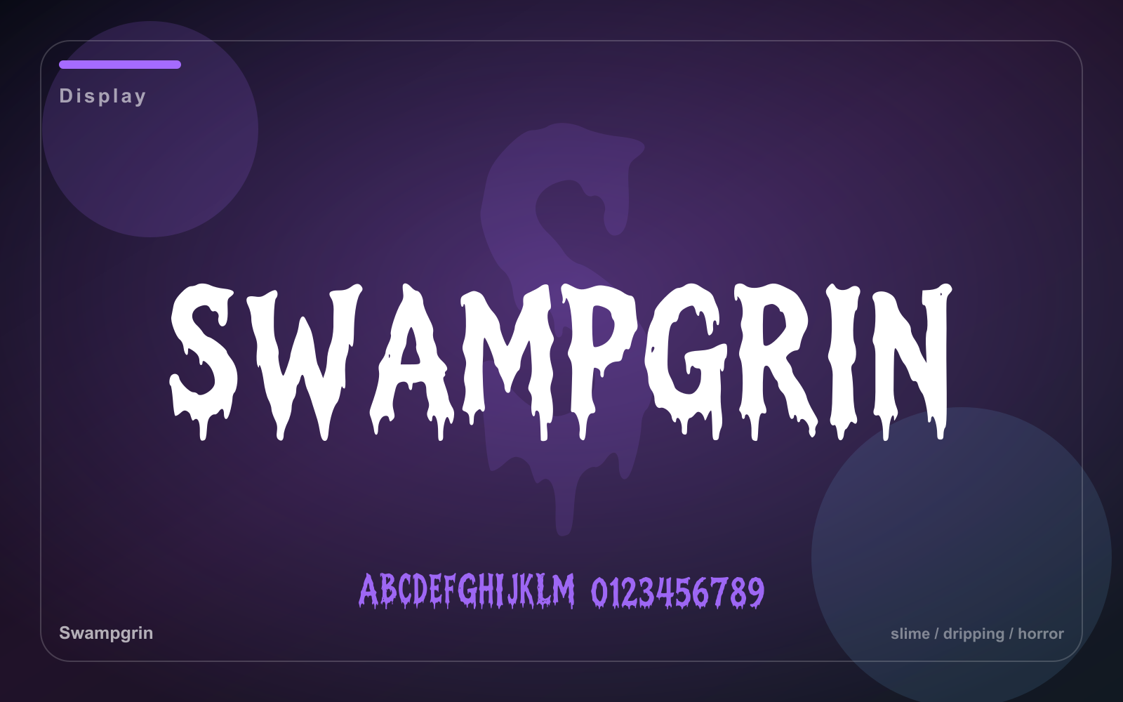
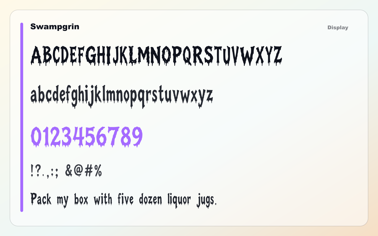
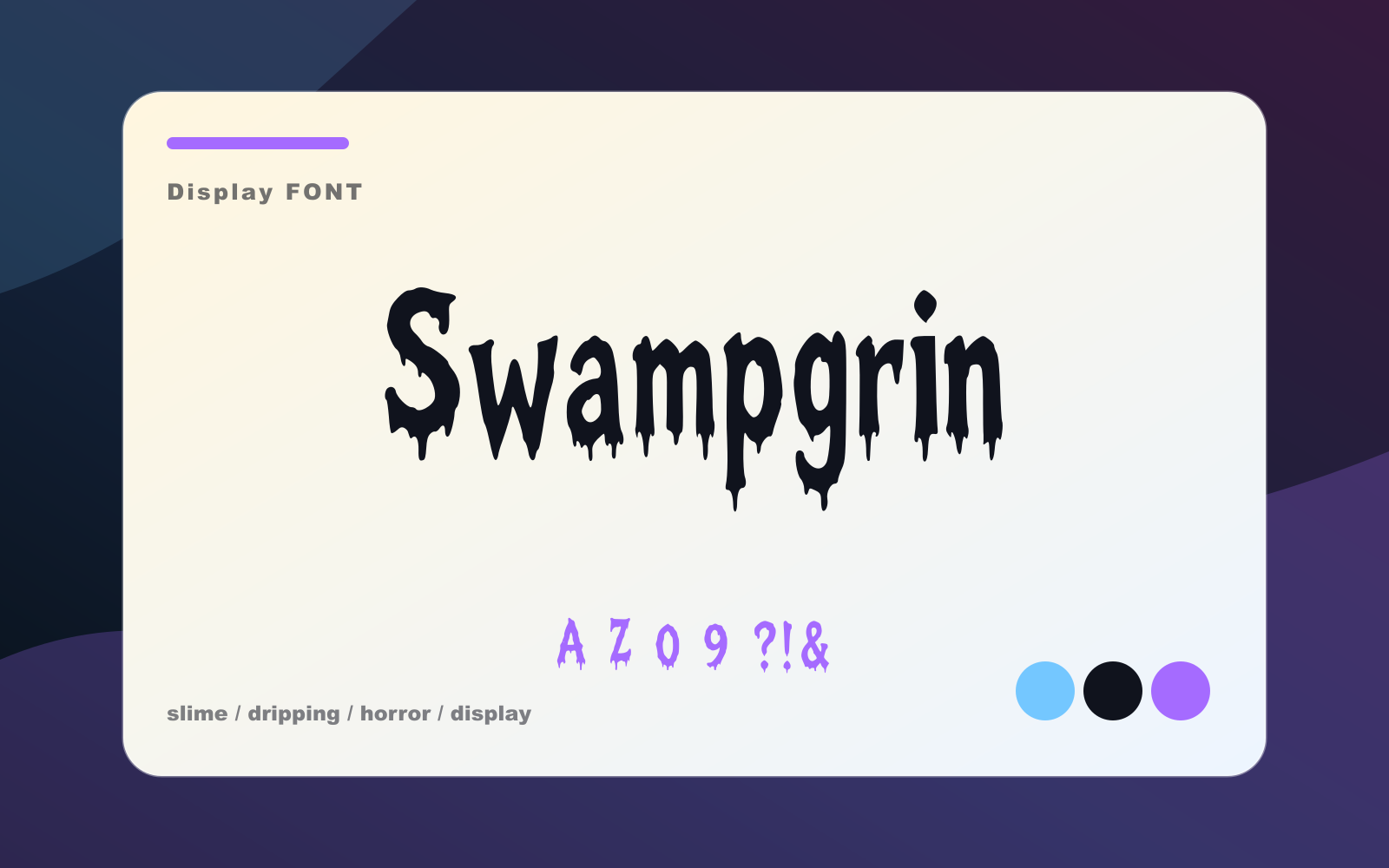
Swampgrin
A dripping horror display face for monster titles, Halloween packaging, posters, and thumbnails.
- Best for
- Short headlines, logos, posters, thumbnails, and brand moments
- Pair with
- Pair with a neutral sans and keep the display face focused on short text.
- Check
- Use it for headlines and marks; switch to a quieter text face for paragraphs.
Also appears in