Carefully handcraftedby real goblins
Hinted & optimizedfor screens
Supports Latin BasicCore A-Z coverage
OpenType featureskerning, ligatures & more
Styles (18)
TTF / WOFF2Showing 9 of 18 styles
See Swampgrin in use
Poster Design
Bold statements that stand out.
Cold Brew
Packaging
Clean, modern, and shelf-ready.
Logo & Branding
Strong identities, built to last.
Web & UI
Readable, responsive, reliable.
Collection
Social Graphics
Engage across every platform.
Showcase
Try Swampgrin
Fork
About Swampgrin
Dripping slime horror display font with blobby black forms
Review highlights
What designers say
4.8
Based on 12 reviews
- 5
- 10
- 4
- 2
- 3
- 0
- 2
- 0
- 1
- 0
1 / 6
Related font previews
#1 / Display
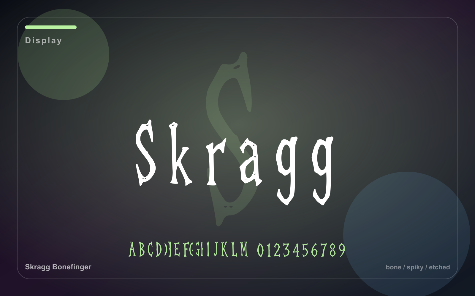
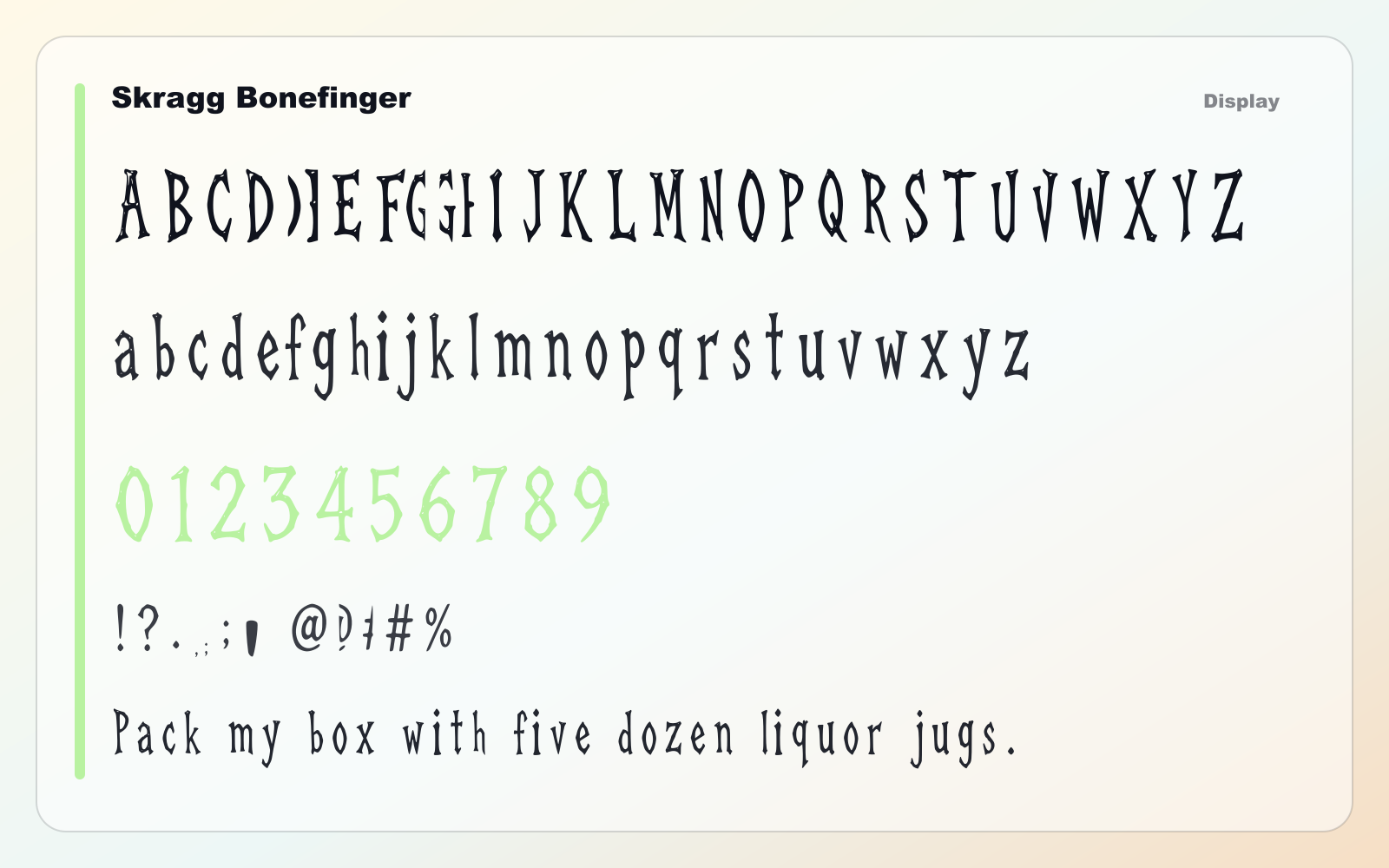
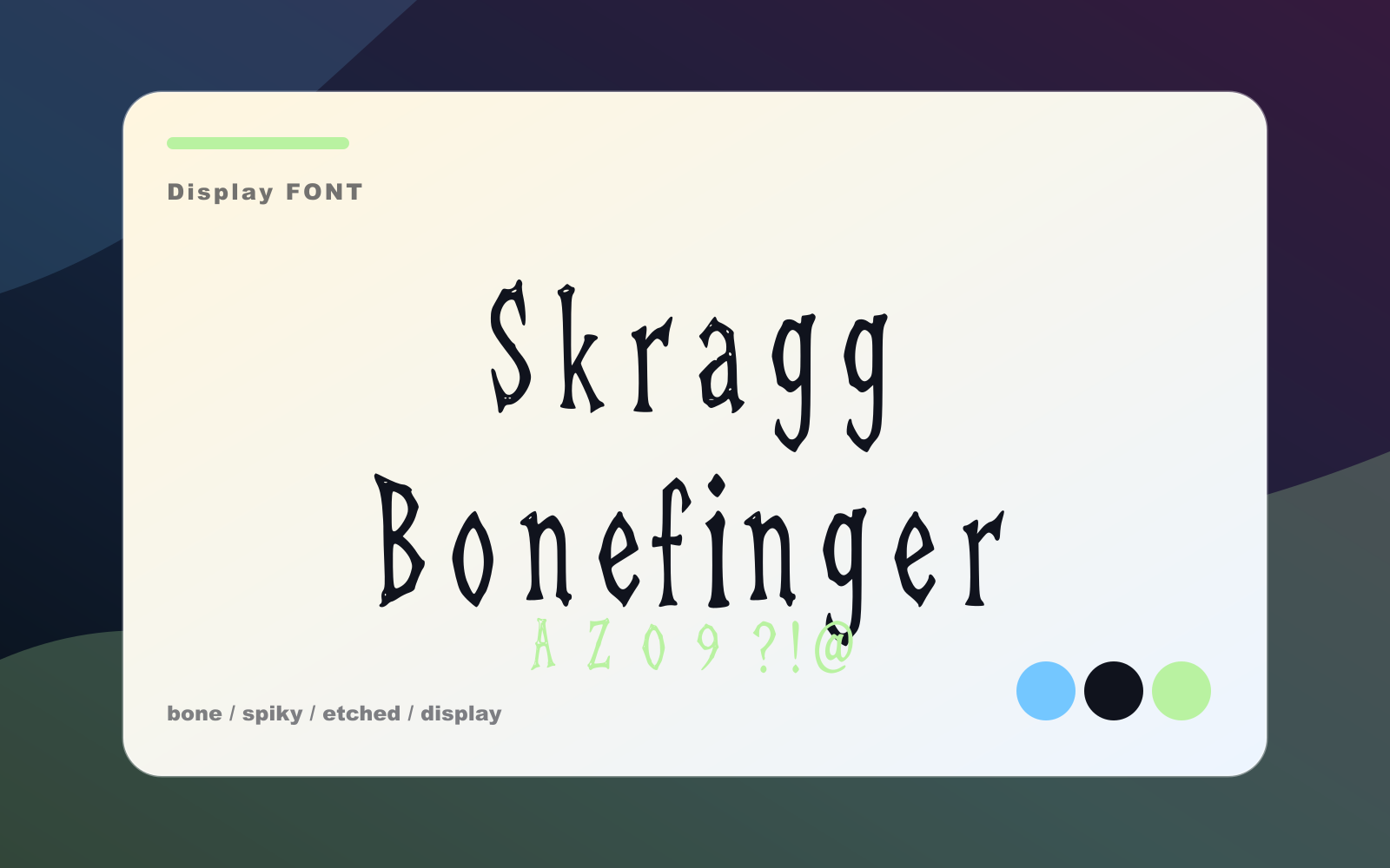
Skragg Bonefinger
A bony fantasy display face for creature cards, metal merch, horror labels, and game titles.
- Best for
- Short headlines, logos, posters, thumbnails, and brand moments
- Pair with
- Pair with a neutral sans and keep the display face focused on short text.
- Check
- Use it for headlines and marks; switch to a quieter text face for paragraphs.
Also appears in
#2 / Display
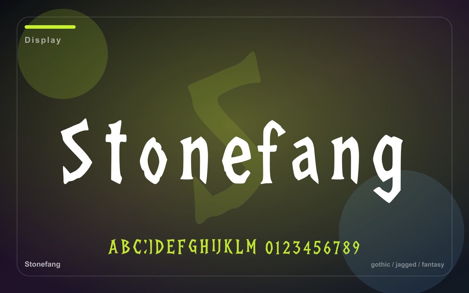
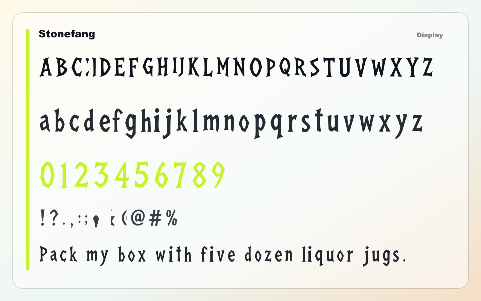
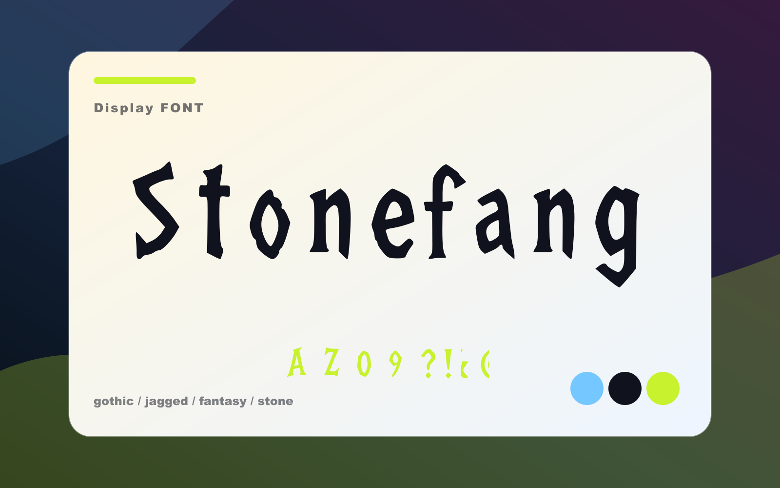
Stonefang
A jagged gothic display face for fantasy logos, posters, game titles, and sharp-edged merch.
- Best for
- Short headlines, logos, posters, thumbnails, and brand moments
- Pair with
- Pair with a neutral sans and keep the display face focused on short text.
- Check
- Use it for headlines and marks; switch to a quieter text face for paragraphs.
Also appears in
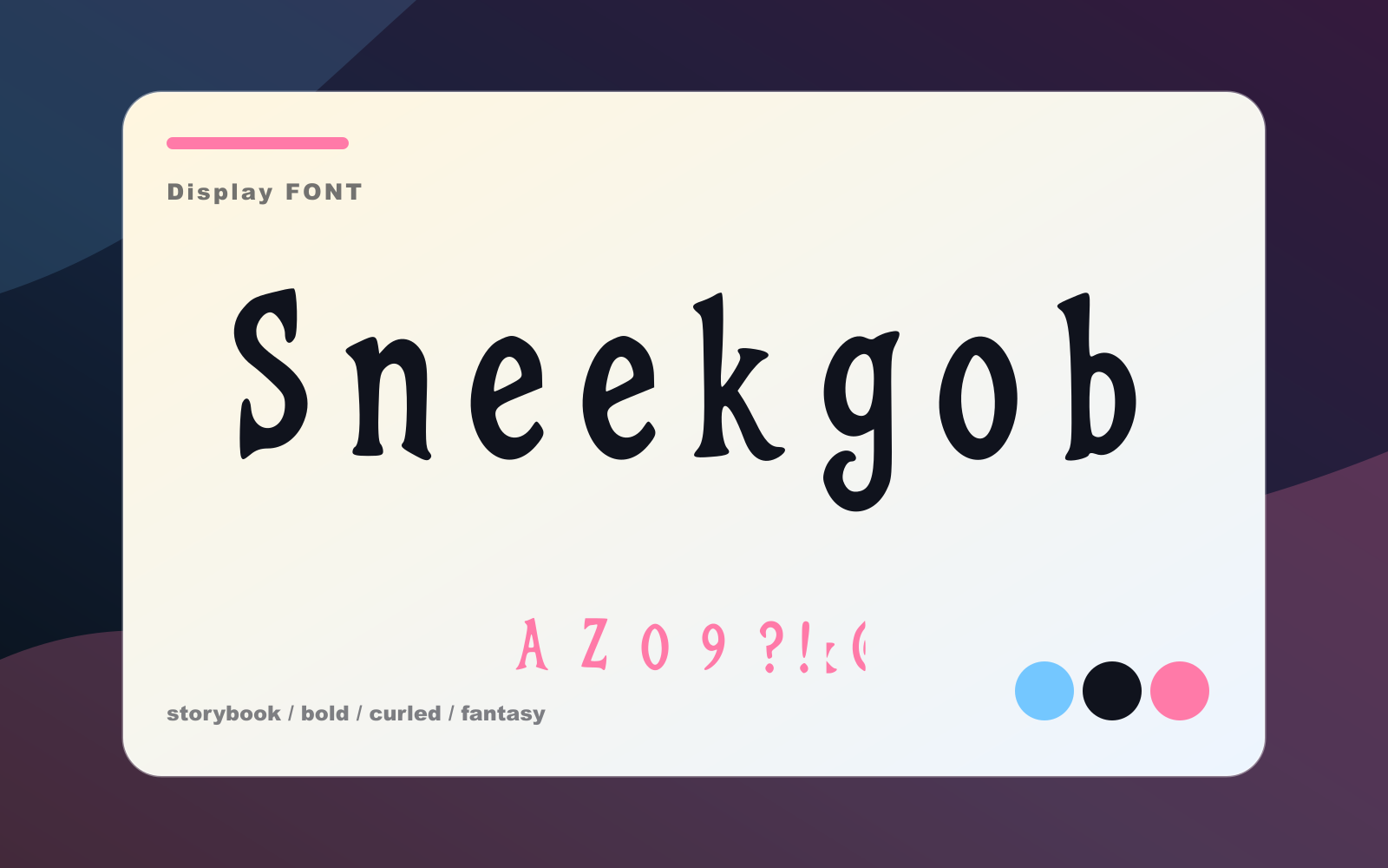
#3 / Display
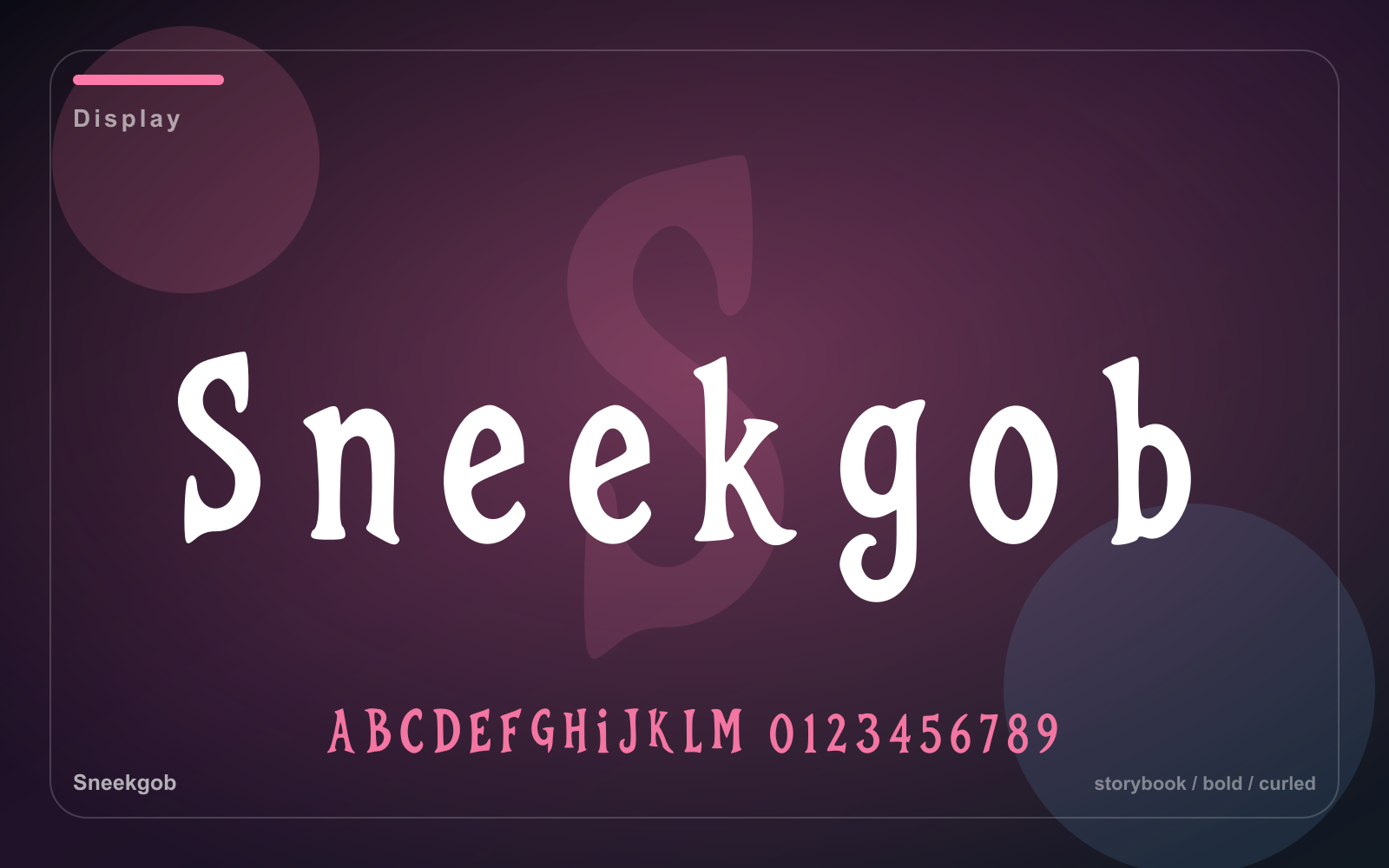
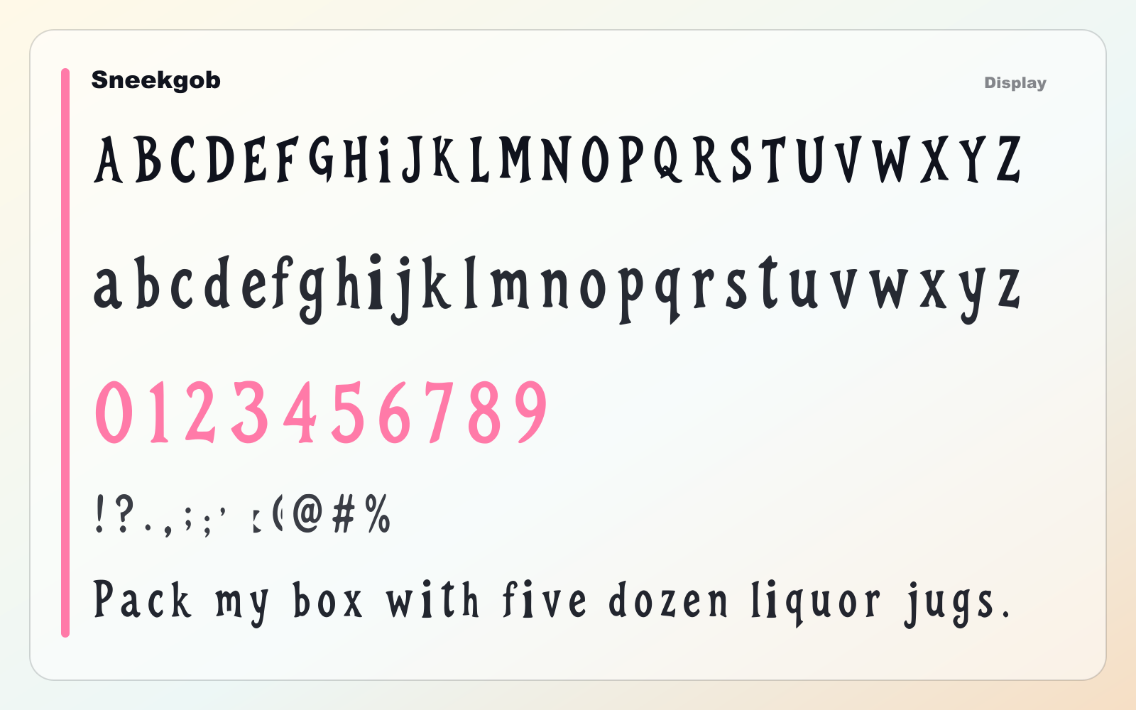
Sneekgob
A bold curled display face for fantasy badges, spooky packaging, posters, and playful title work.
- Best for
- Short headlines, logos, posters, thumbnails, and brand moments
- Pair with
- Pair with a neutral sans and keep the display face focused on short text.
- Check
- Use it for headlines and marks; switch to a quieter text face for paragraphs.
Also appears in
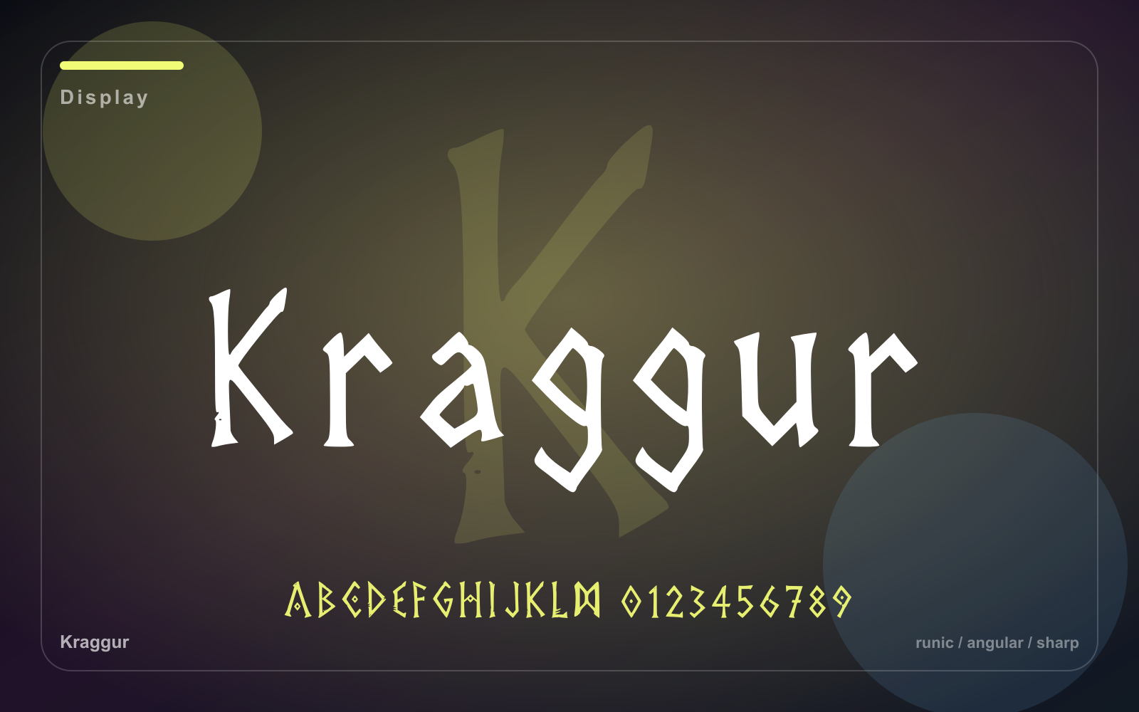
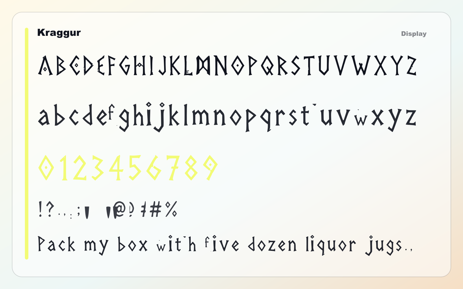
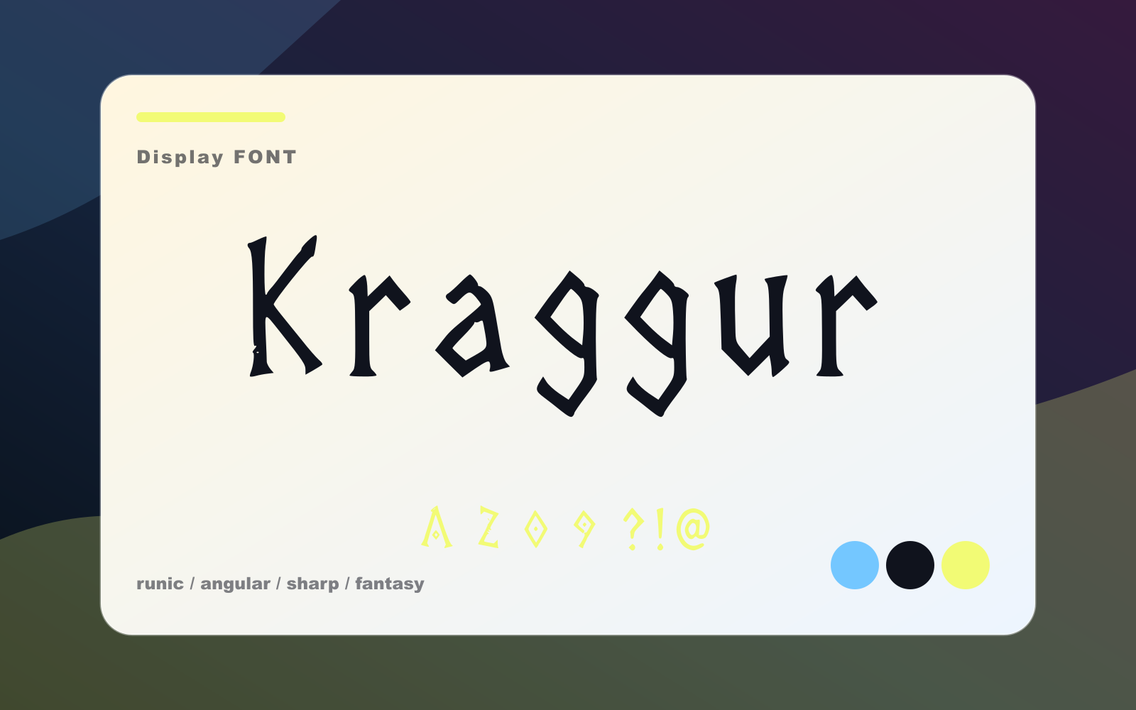
#4 / Display
Kraggur
An angular runic display face for fantasy maps, clan marks, game UI, and carved title cards.
- Best for
- Short headlines, logos, posters, thumbnails, and brand moments
- Pair with
- Pair with a neutral sans and keep the display face focused on short text.
- Check
- Use it for headlines and marks; switch to a quieter text face for paragraphs.
Also appears in