Carefully handcraftedby real goblins
Hinted & optimizedfor screens
Supports Latin BasicCore A-Z coverage
OpenType featureskerning, ligatures & more
Styles (18)
TTF / WOFF2Showing 9 of 18 styles
See Goblinking in use
Poster Design
Bold statements that stand out.
Cold Brew
Packaging
Clean, modern, and shelf-ready.
Logo & Branding
Strong identities, built to last.
Web & UI
Readable, responsive, reliable.
Collection
Social Graphics
Engage across every platform.
Showcase
Try Goblinking
Fork
About Goblinking
Royal spurred fantasy serif with sharp ornamental caps
Review highlights
What designers say
4.8
Based on 12 reviews
- 5
- 10
- 4
- 2
- 3
- 0
- 2
- 0
- 1
- 0
1 / 6
Related font previews
#1 / Serif
Velvet Bramble
A decorative serif with botanical tension, pairing soft thorns with refined title shapes for lush branding.
- Best for
- Editorial titles, boutique packaging, book covers, and refined logos
- Pair with
- Pair with a quiet sans for navigation, captions, and body copy.
- Check
- Preview thin details on small screens and busy backgrounds.
Also appears in
#2 / Serif
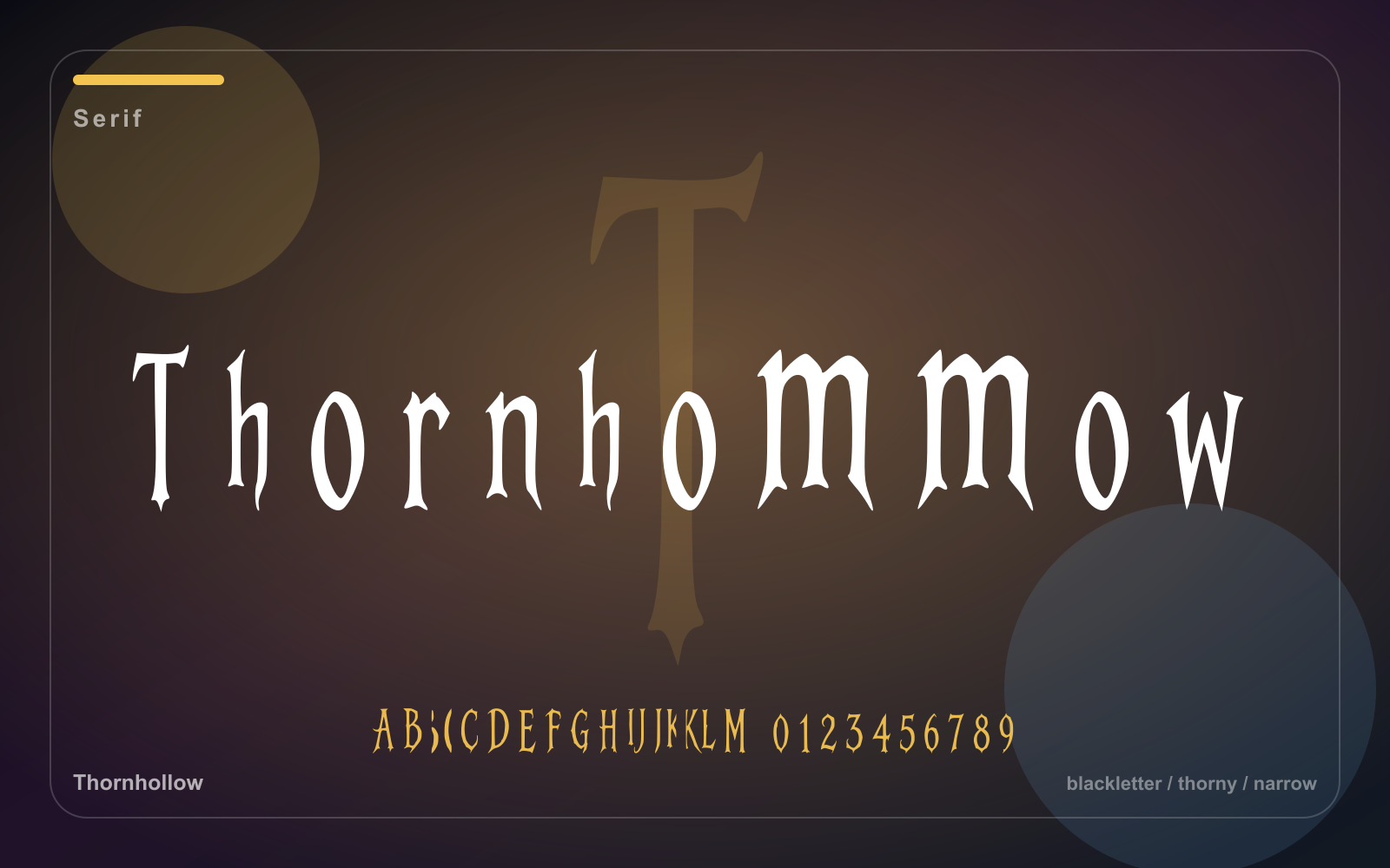
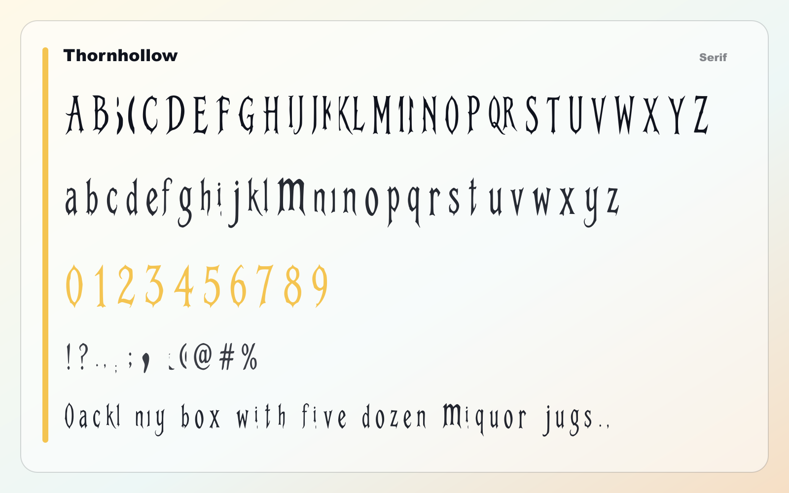
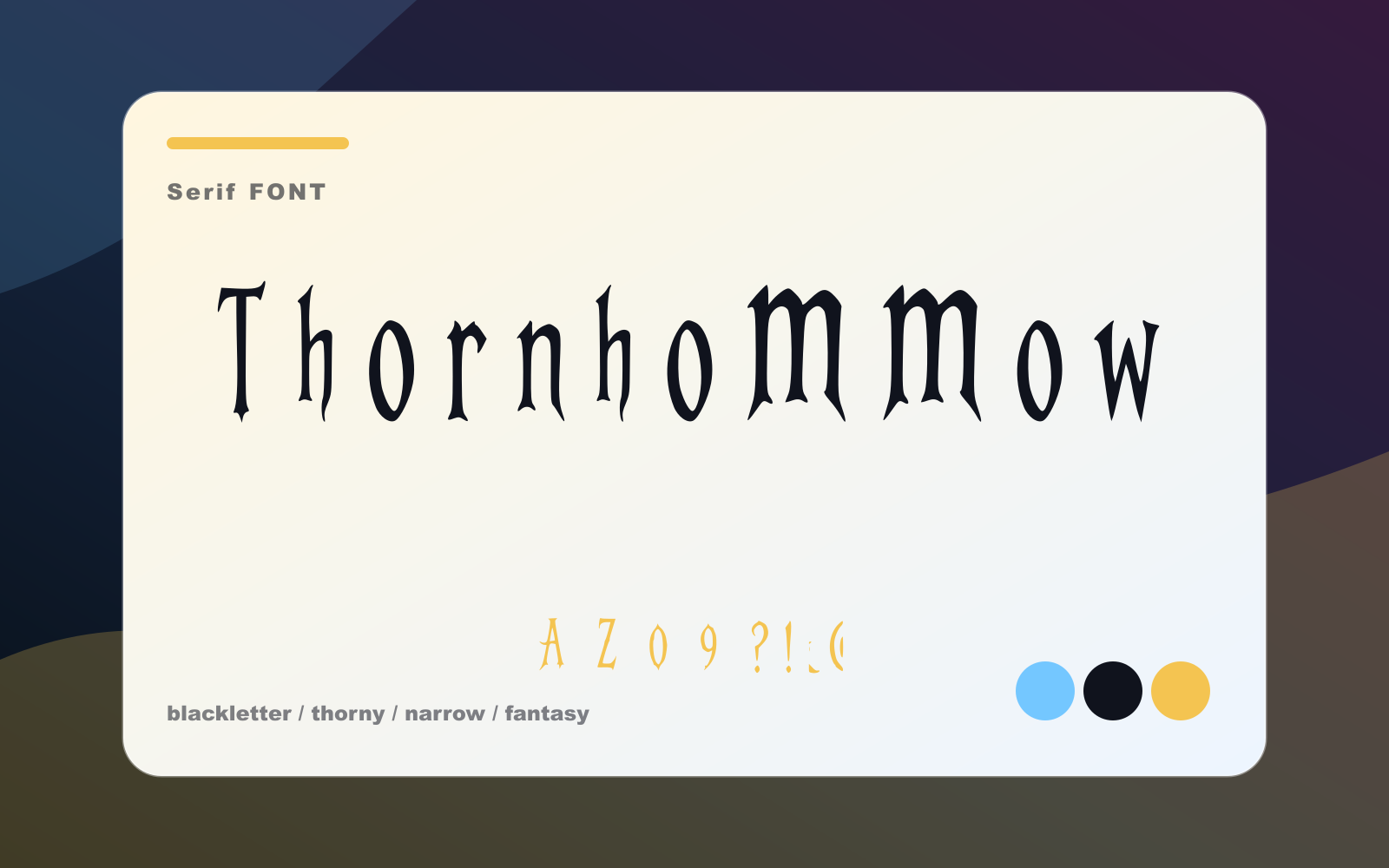
Thornhollow
A narrow thorned serif for dark fantasy covers, lore cards, menus, and dramatic headings.
- Best for
- Editorial branding, covers, boutique titles, and culture-led campaigns
- Pair with
- Pair with a quiet sans for navigation, captions, and body copy.
- Check
- Preview thin details on small screens and busy backgrounds.
Also appears in
#3 / Serif
Toothcap Serif
A storybook serif with sharp caps and goblin bite for fantasy covers, menus, and characterful packaging.
- Best for
- Editorial branding, covers, boutique titles, and culture-led campaigns
- Pair with
- Pair with a quiet sans for navigation, captions, and body copy.
- Check
- Preview thin details on small screens and busy backgrounds.
Also appears in
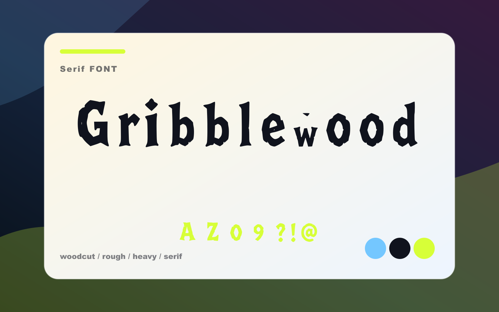
#4 / Serif
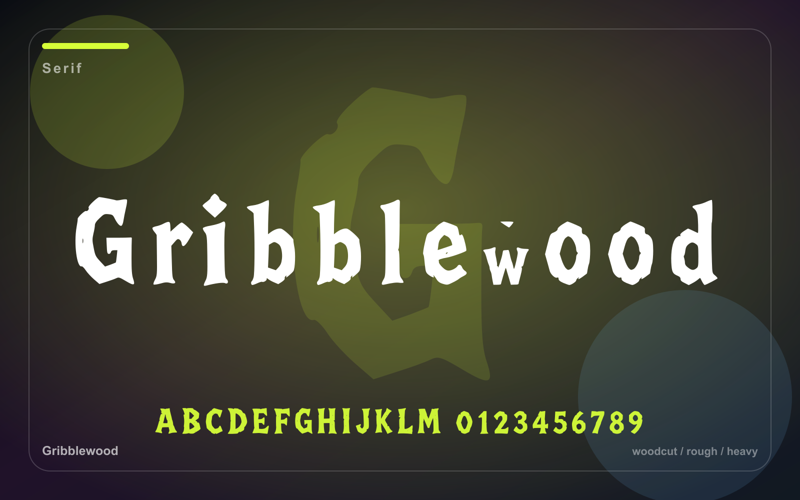
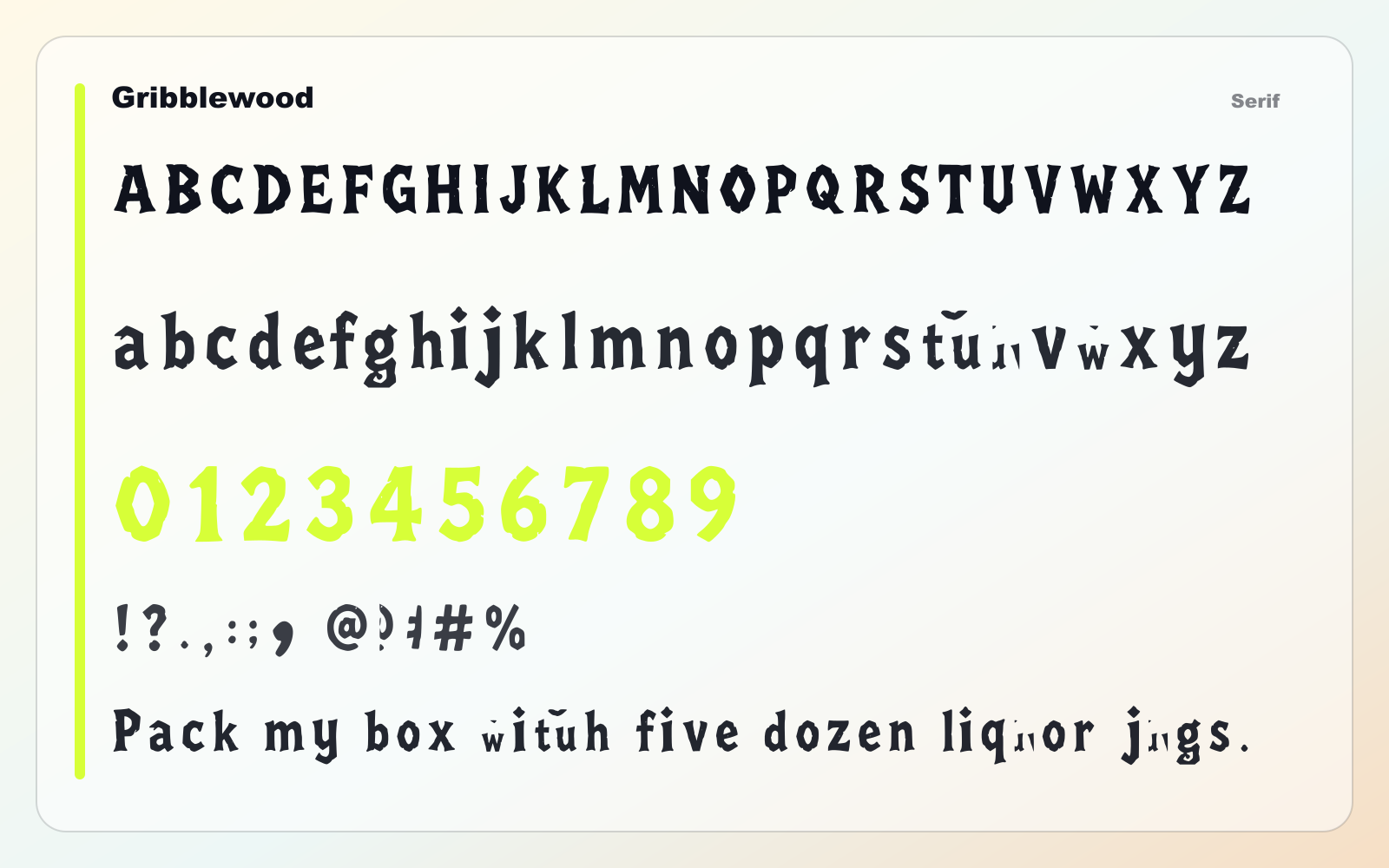
Gribblewood
A heavy woodcut serif for rustic fantasy branding, tavern signs, labels, and chunky headlines.
- Best for
- Editorial branding, covers, boutique titles, and culture-led campaigns
- Pair with
- Pair with a quiet sans for navigation, captions, and body copy.
- Check
- Preview thin details on small screens and busy backgrounds.
Also appears in